LINE
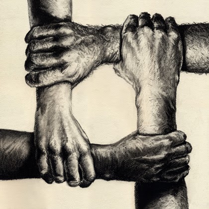
This image depicts an art piece which demonstrates a good usage of line.
SHAPE
This image is an example of how shapes come together to make something a beautiful art piece. Notice and triangles and squares that complement the circles.
COLOR
The flower expresses a great usage of pink color. It uses shadows well to add darker and lighter values of color.
SPACE
The usage of space is defined in these two images. The difference of space the white part gets in comparison to the black part is very appealing.
Texture
The texture of this tree is very rough and ripply. It set off from the soothing feel of a tree. In these ways a texture of an art piece can really add feel to it.
RHYTHM
The patterns of lines have there own rhythm and create a movement for the art.
Proportion
The greater proportion of fish really demonstrates the power that the one wielding the fishing pole has. In this way proportion really implements the value of power in this art piece.
Emphasis

As you can see in the photograph above, the yellow strawberry is emphasized by placing three of the same strawberries in red color around it.
Unity
The picture uses multiple hands to make them come together into one essence.
Balance
The picture depicts balance between two halves.


